
Aspiro
Helping a new management consultancy find its place in the world.
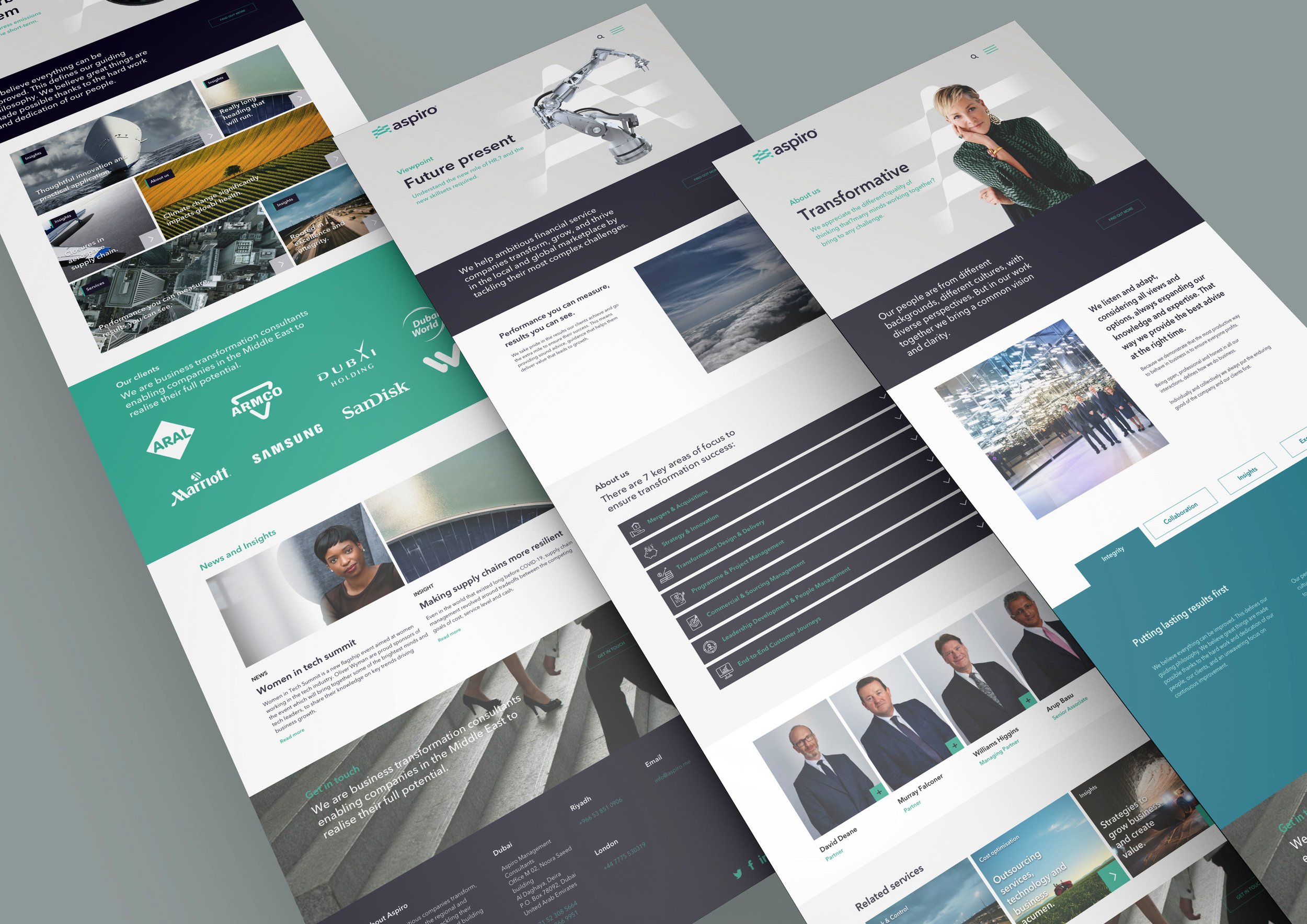
Aspiro is a business transformation management consultancy dedicated to the financial services industry. They help ambitious companies transform, grow and thrive in the regional and global marketplace by tackling their most challenging projects and building new capabilities.

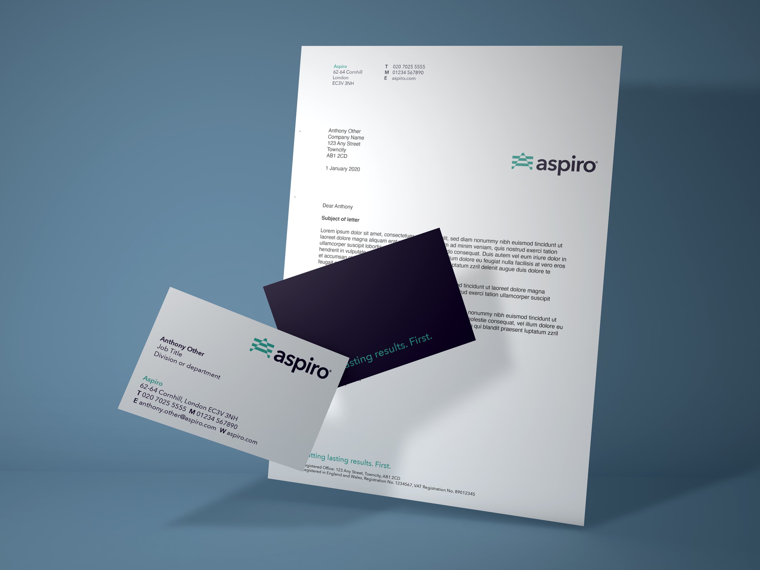
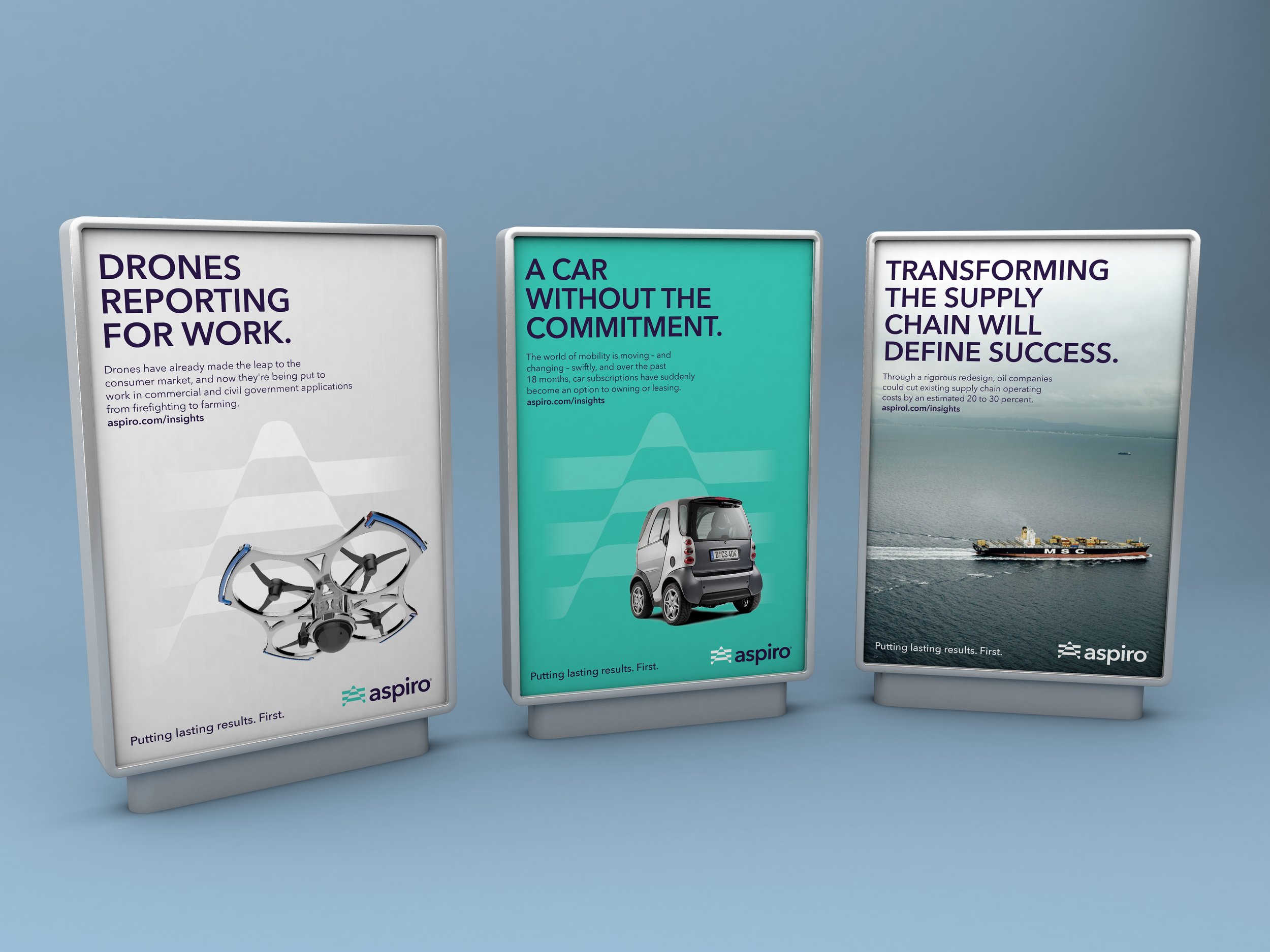
Putting lasting results. First.
Working with Aeron Branding, we developed the visual identity for Asprio. The identity communicates a positioning about co-creating value and empowering pioneers. This was summarised in the strapline 'Putting lasting results. First.'
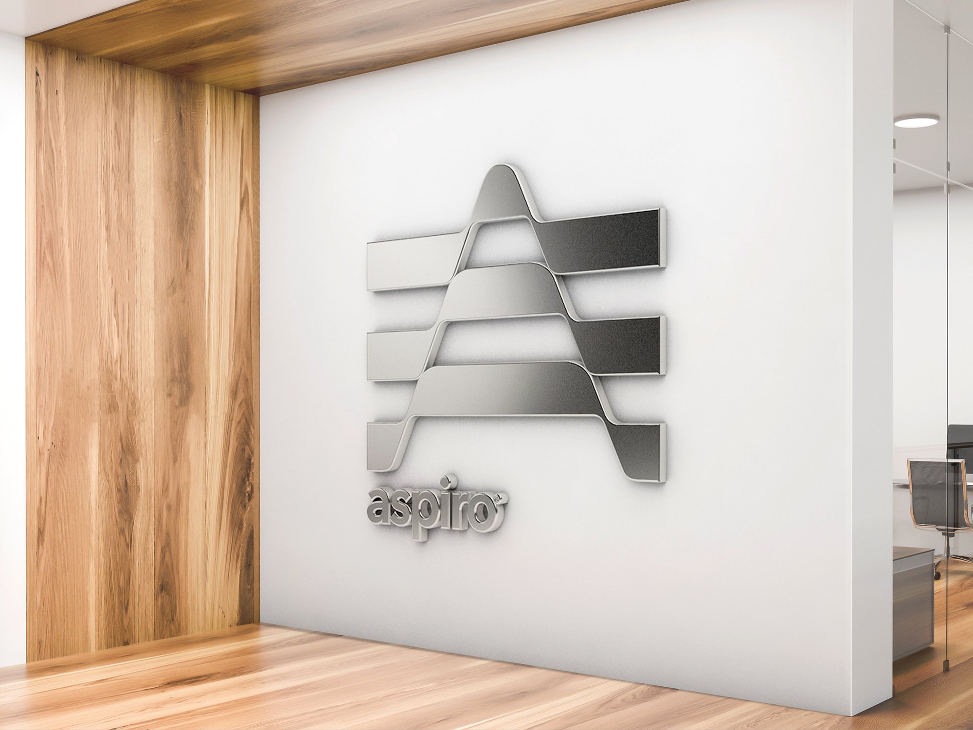
The Aspiro symbol combines an abstract 'A’, an upward pointing arrow and a flag. It suggests co-creation; the coming together of different ideas to produce positive results. The symbol can be used as a traditional sign-off as well as a 'supergraphic' background. The logotype feels timeless, contemporary, clean and professional.
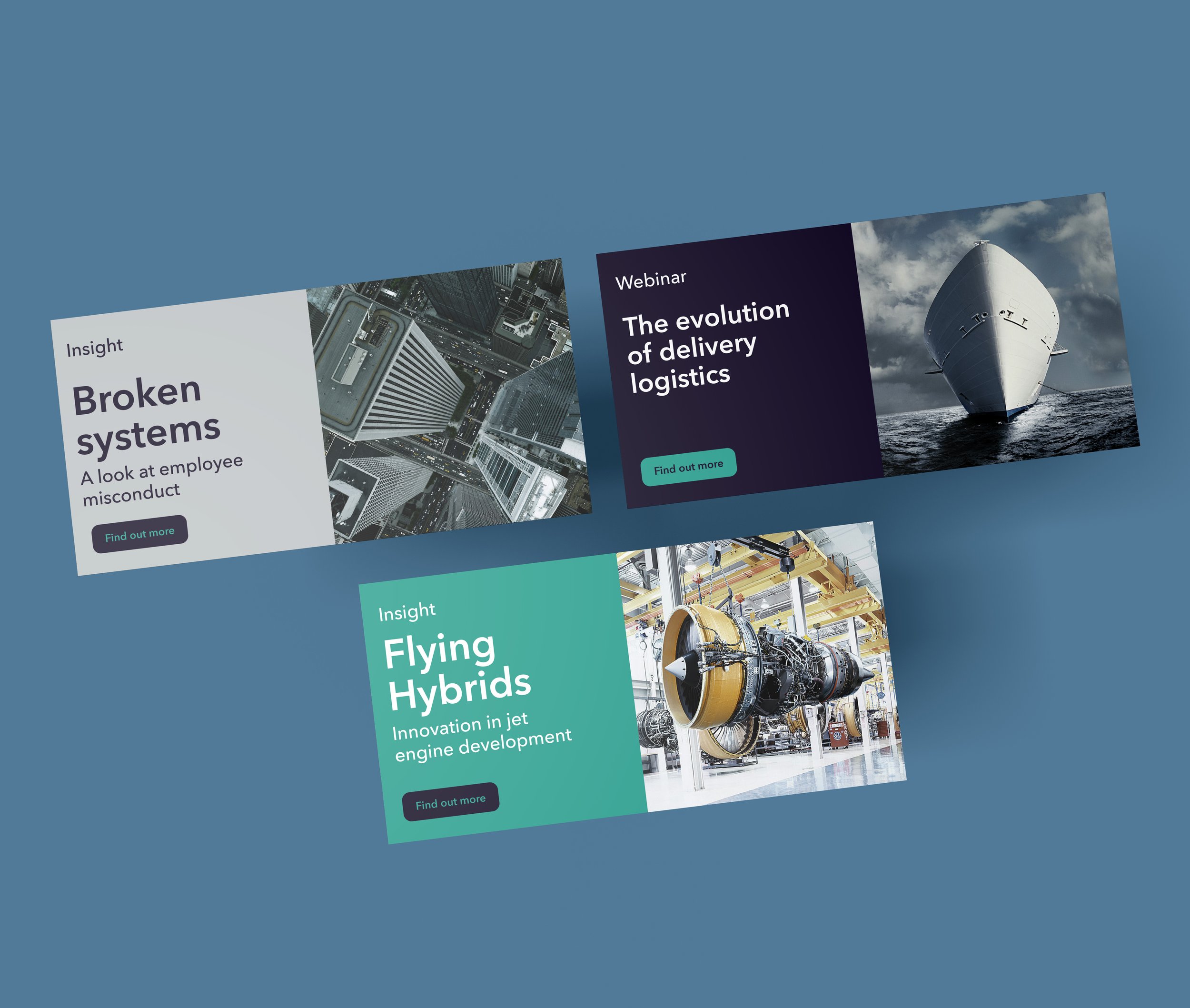
Brand Strategy | Naming | Visual Identity | Communication Design | Website Design | Social Media Toolkit