Logo
Making a direct insurance brand feel more relevant and easier to navigate.

Logo is the direct to market brand of Tranquilidade Seguros. Their online and telephone offer covers five types of insurance – car, motorbike, house and contents, medical and life.
Logo’s main customer base comes from the larger metropolitan areas of Portugal. The audience is younger than parent brand Tranquilidade, with the focus primarily on millennials.
There was a clear disconnect between Logo’s innovative products, and the way the brand was perceived. The main touchpoints, the website and app, felt crude and unsophisticated when compared with other European competitors.
Whilst value was very much at the heart of the proposition, Logo just felt too basic and downbeat.


An emphasis on convenience.
Working with Kayak Lisbon, we refreshed the messaging structure, and put greater emphasis on Logo’s way of doing things: painless, modern and accessible.
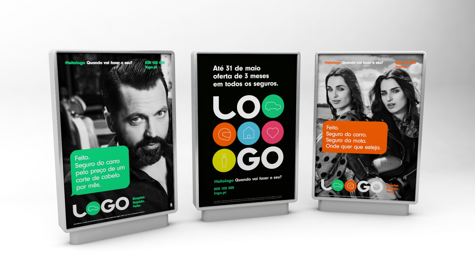
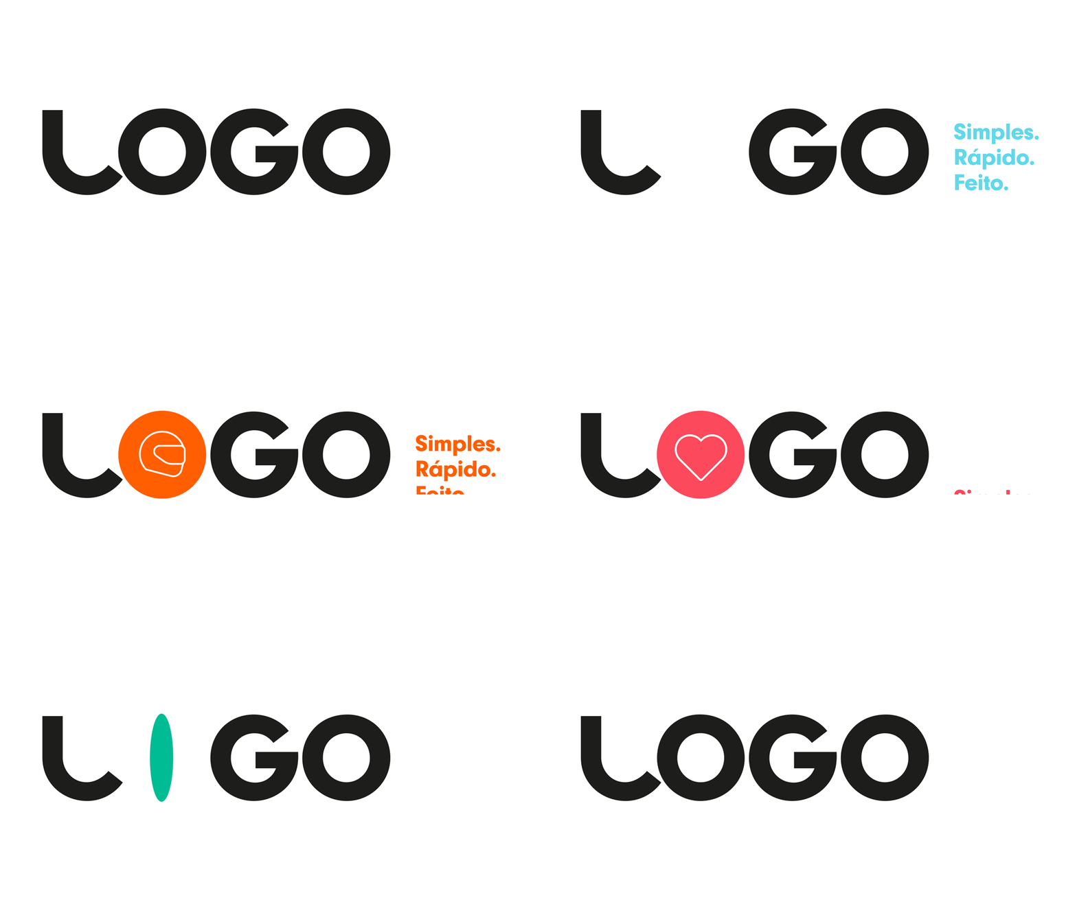
A new logo system and iconography were developed which communicated Logo’s specialism in five main areas of insurance. A bright new colour palette and coding system were introduced which is friendly and upbeat.
Modifications were made to the website and app architecture and UX in order to make them easier to shop and navigate. Both touchpoints were brought in line with the new visual system.


Making benefits more tangible.
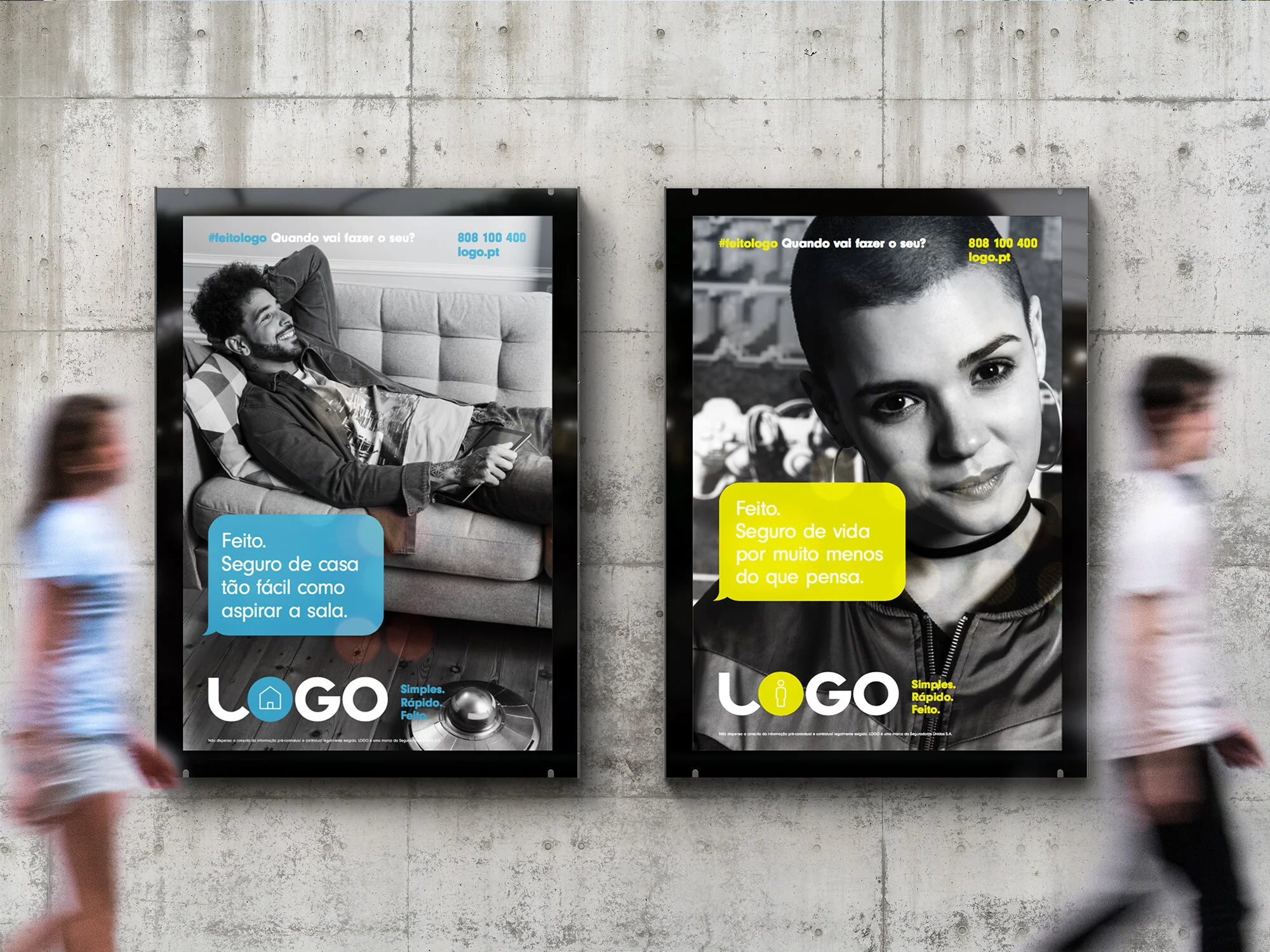
The launch advertising campaign was produced with Kayak Lisbon and 78 Lisbon. The films compare everyday situations with the simplicity, speed and cost of buying insurance from Logo. This is summed up in the strapline Quick, Simple, Painless. The ads ensured Logo started to be perceived as more relevant, upbeat, modern and convenient.
Brand Strategy | Visual Identity | Communication Design | Website Design | UX & UI Design | Art Direction | Advertising
