
Tastefully Canadian
Creating the retail focal point of Toronto Pearson Terminal 1.

Tastefully Canadian is operated by The Nuance Group and sells authentic products produced by local suppliers. The store presents a dynamic range of local produce, from artisan foods to artwork to ice wines.
We were asked by their lead design agency, The Design Solution, to produce a visual identity and packaging range, and unify a series of store concepts together into a cohesive customer shopping experience.

A strong holistic approach.
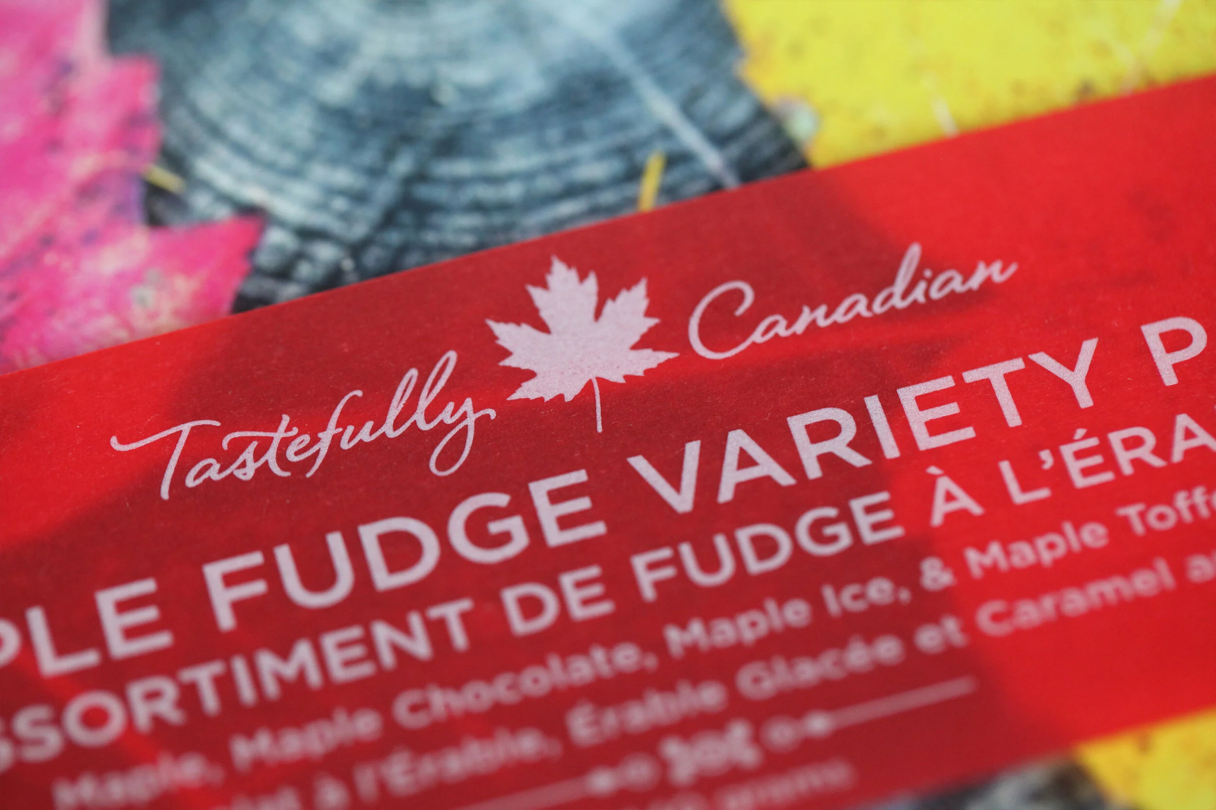
Many iterations were produced for the Tastefully Canadian logo. The preferred option was in many ways the simplest; the use of the maple leaf along with the national colour, red.
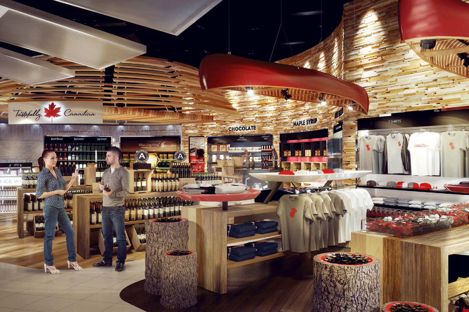
The interior concept highlighted a strong sense of place. Block timbers and wooden flooring were modelled around a circular structure. White was used to contrast the timber feel.
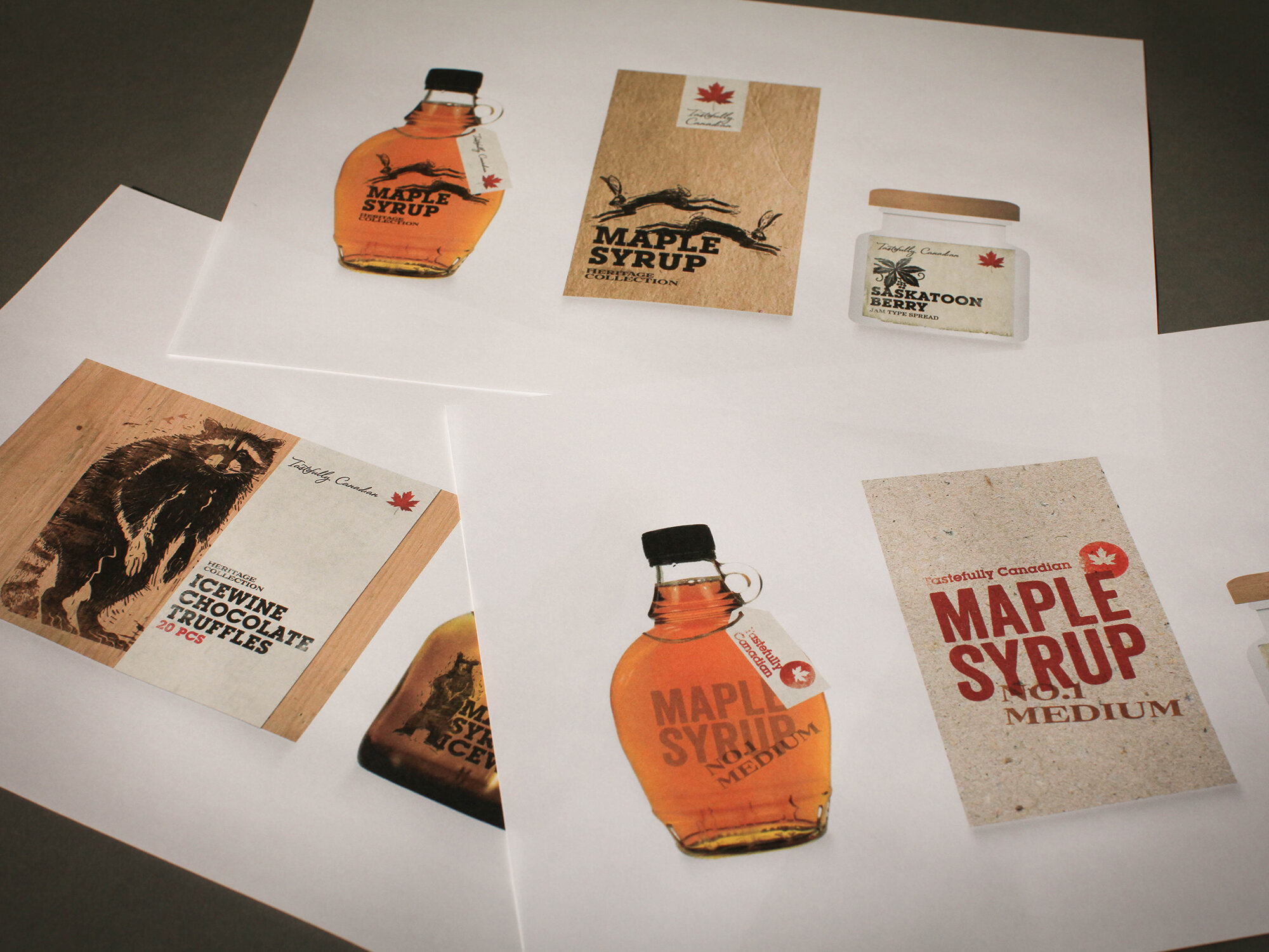
The packaging concepts work holistically with the interior concept. A common basic visual toolkit was used in different compositions, and with different material textures. This created a strong and clear visual hierarchy of three core produce ranges - basic, heritage and signature.


Whilst each range has its own unique look and feel, each highlights the country’s finest products and landscapes. The use of a horizontal strip containing key product information was used as a unifying feature across all products.


A complete experience.
The result is totally cohesive. From the sign over the door, through to the store furniture and packaging on the shelf, the customer enjoys the same engaging and comprehensive retail experience.


Brand Strategy | Visual Identity | Packaging Design | Interior Design